Using Flickr for photo management appears to be a great value proposition. Store all your photos, and in turn, they offer a full terabyte (that’s 1000 gigabytes!) of drive space. For all the different options for storing and managing photos online, Flickr can’t be beaten. Right? As good as that is, Flickr also has to be the most annoying and convoluted systems to use for managing and sharing photos. Today, I thought I’d look at Flickr‘s worst offences.
1. Uploading: If I wanted to just upload all related images in a batch (and sort them out later), Flickr makes this difficult. Deleting photos from an album is a one-by-one process.
2. Canceling on Mobile: When uploading from the iOS app – there is now a progress bar – but if you accidentally included a video and needed to cancel the process, that appears to be impossible.
3. Editing Titles on Mobile: The process of editing an image’s title is a full four taps. If you go through a few images, You’ll be extremely frustrated.
4. The Batch Organizer: This and the album organizer tools duplicate features and generally make little sense. Also, when in the Albums & Collections view of the organizer, the interface doesn’t have a permalink – so it cannot be appropriately refreshed. After making a number of edits to image tags and descriptions, a mistaken back for forward in the browser may appear to destroy changes. Even worse, movements into (or out of) these screens cannot make use of the browser’s back or forward buttons. Frustrating.
5. Flickr’s Tools site: It doesn’t link directly to the Download in any way. In fact, you have to go to Flickr.com/uploads. Even then, Flickr checks your operating system and doesn’t offer any other options for downloading, if, you wanted that.
6. Sharing: Sharing an album is quite trivial (for example) but if you wanted to share a large format, original image, you have to go into the sharing tool, select code (like BBCODE), size, and then find the file’s link in the code and copy it (for example [1]). This an impossibly daunting process for non-tech savvy users. More proof of how sharing photos with Flickr sucks: take a look at a Reddit devoted to sharing images. See how many different types of pages you land on with the different links? Flickr should have one simple cohesive way to see a raw image and simple web viewer. Imgur does this so well, that Flickr should be taking cues from them.

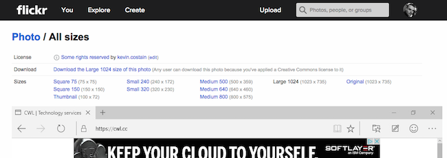
7. That “All sizes” page: I have to think that when a user comes across this disagreeable amount of numbers – they go away sad. They wonder why they bothered thinking they could figure out downloading an image off Flickr.
Perhaps a sign that they are improving? The Flickr Uploadr tool ( 1.0.341b on OS X) appears to work well for uploading full directories of files. Even better the tool makes images private by default.
But, as a Flickr user, you probably know all of these pains (and then some). My hope is that the brass at Yahoo! take a serious look at their flagship tool and do a major overhaul. Flickr could be the premier place to share and store images on the internet if they just corrected some of these stupid usability problems. What’s your Flickr pain?