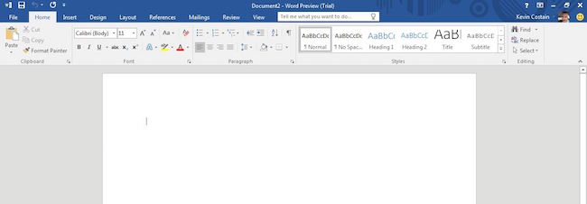
Today, I noticed the public preview for Office 2016 is available on Microsoft’s site. The downloaded file is very small and goes out to download the rest of the application by way of “streaming” [1]. On a 25mbs Internet connection, I had the application installed in about 10 to 15 minutes. Given that a new version of Microsoft Office is a major milestone (and something everyone will a computer will eventually need to use), I thought I’d take a look at what’s new.
First, the installer asked for no product key. During the installation, and after – I wasn’t asked at all; and, I was expecting it. While one is provided on Microsoft’s site, I’m not sure where that would be used, if at all. This application preview is a 180-day trial. Interestingly, there’s a “buy” button next to the trail that takes you to a page where you can purchase Office 365.
Of course, it’s big. On 32bit Windows 7, the drive space Office 16 used was a whopping 1.5 GB. This would most certainly be larger if the 64bit version was installed. To say that these applications are taking up more space is a huge understatement, and I’d like to see the size and installation differences on the various different supported platforms and operating systems. I also notice a \vfs older that stored more than 350 MB of data, though it’s not clear if that is some sort of backup or part of the app.

You’re probably wondering what’s new here. Unfortunately, not much. It seems clear this is an iterative release more than anything. Office doesn’t appear to have gotten any sort of major usability makeover.
Some of the new stuff to take note of:
1. Theming is here – When setting the theme in File > Account > Office Theme, Office will change various visual elements across all its applications. There weren’t many themes in this preview, but I’m sure many more will be included (and created if it’s an open standard). When using some themes (like dark gray), many of the visual elements interfered with seeing txt (that stayed in black). I presume they’ll do more work on that before the final release.
2. Image Rotation – A feature sure to annoy many, Office will automatically rotate images as they are inserted into a document. I did not see anywhere in the options (Word) that this could be turned off, so it may mean an extra click every time you insert an image.
3. New Search Box – The “Tell me” search box at the top of some Office applications allows the user to just say what they’re trying to do. When I type “Write a letter”, the application shows you links to templates or menu items related. More obscure terms like “Write a love note” did not do much.
The rest appears to be under the hood. For example, with higher DPI options, those with big screens and take better advantage of them. Other changes such as Office 365 and other backend stuff make it feel very much like an update. Even more challenging though, would be to find out the features that have been removed from previous versions of Office. That is information Microsoft doesn’t publish (that I can find anywhere).
In all, there were no discernable new features. More and more, this is Office. It’s getting more difficult for Microsoft to differentiate the newest version from the last, and that’s probably a good thing for users. All the same though, why does Microsoft still try and milk the cash cow?
If you want to see more of this Microsoft Office Preview, I took a number of screenshots. You can check them all out here.