Why I Think The JooJoo Tablet Device Is A Dud
You may have heard or seen the recent controversy related to Fusion Garage’s JooJoo/Crunchpad that was demoed yesterday. The JooJoo would be the first (of many?) tablet devices to hit the market. These devices let you browse the web and use applications with a great form-factor – it would be great if you were to sit on your couch and read the news or browse the web wirelessly. I have been looking for the live stream of the original demo event, but I haven’t been able to find it? If you know, please share. There are a couple hands-on demos that have floated around also – like this one from Gizmodo:
The device looks great – but – beware – this thing is a dud. Here’s why.
1. The price sucks. $499us to browse the web, only browse the web? It’s not going to sell much at that price at all.
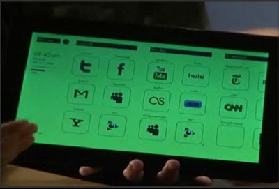
2. For almost 2 years of work, this device has a huge number of technical issues to work out. Don’t believe me? Look at the demo above closely. The device clearly has graphics issues. What was described as a “trick of the camera” in the earlier demo is clearly not the case. When going back to the home screen, demos have shown the device change to green, purple, red, blue. In another demo, using the accelerometer to change the orientation caused some screen garbling.
3. Things don’t work the way they should. The gesture to get back to the home screen is a “Zoom” pinch. This gesture was even described in a demo by Chandra Rathakrishnan himself as a “zoom” pinch. Why in the world are they re-writing one of the most basic muti-touch gestures into something different? What other functions of this device have they re-written that will make this device a difficult thing to use. What’s more – how would you zoom a web page?
4. The main/home screen appears to be poorly or haphazardly designed. They have a lot of work to do to make this look useful or appealing. Take a look at the main menu on the JooJoo (from the original demo):

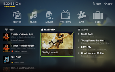
Now take a look at the just-released menu of, say, the Boxee Box:

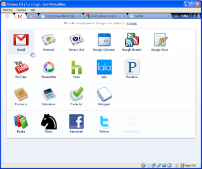
Or even ChromeOS:

You can see there is some design work involved in Boxee and ChromeOS – but the JooJoo looks like it’s just a bunch of links hobbled together on the screen, not even all of the links and icons show up. After almost 2 years, this is the best they have?
All in all – this doesn’t look so good for Fusion Garage – they should go back and fix these things and make it work for a price well below $499 before coming back out with a product. Considering the possible legal hurdles for them in the future – I would say that is their best bet.
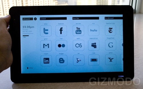
I’ll leave you with one shot that I think shows how truly wrong this is. This device’s home screen is clearly being shown off in the daytime – and yet, the person demoing the device (Chandra Rathakrishnan?) has not bothered to set the time. It’s probably a sign:


