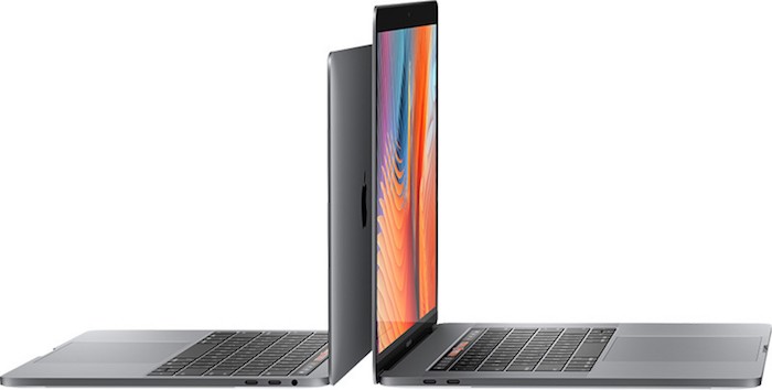
Review of the Macbook Pro Late 2016 (Touch Bar)
This 2016 Macbook Pro refresh has been a long time coming. Since May of 2015, in fact. My last computer was a Retina Macbook Pro (2015) with reasonably similar specifications, which stood as the previous model, but due to this massive re-design, a far different computer. Over Christmas 2016, I took the plunge and decided to go with this high quality (but recently beleaguered) line of a laptop in my own way (as an I.T. Professional).
The configuration of this computer, as I test it, is the highest currently available from Apple. The following are its specifications:
Model: MacBook Pro (15-inch, 2016), (MacBookPro13,3)
Processor: 2.9 GHz Intel Core i7
Memory: 16 GB 2133 MHz LPDDR3
Graphics: Radeon Pro 460 4096 MB
Storage: 512 GB SSD Drive (SM0512L)
Price: Arm, Leg, and your firstborn (not including dongles)
Some of my impressions of this computer as I use it (in no particular order):
Keyboard: Wow, has this thing changed. It’s lower to the metal and feels so flat and uninviting. My first impressions were that I was going to need to tap harder to get any sort of haptic feeling from touching the buttons. As I write this first long-form text on this new keyboard, it is growing on me. I know I can learn to live with this, but I’m not quite sure of the design process that leads to changing something that others have copied1. I do find myself reaching for the ESC key and hitting the damn tilde every time. Arg.
Touch Bar: Much has been said of this new space and what it delivers. I do like the brightly lit and very touch-compatible controls, but this is very new in the game, and so few applications support it. For the apps that do, there is a menu item in “View -> Customize Touch Bar…” that at least improves the utility. As I had suspected though, the base MacOS level touch bar options are lacking. What this has amounted to is not being able to control what’s there. Some of what I’ve lost:
- I used the Display control keys to quickly access the brightness when playing video (up) versus when trying to conserve battery power (down). When “Show Application Controls” is enabled, there seems to be no way to do this easily.
- The Function Keys were great, and I used them often. F5, F8, F11 – I’ve commonly used them in a remote control context for Windows computers. But, I would have loved to just statically force these keys on the Touch Bar’s right side.
A lost opportunity for compatibility. Turns out you can enable the function keys per application (such as a remote access app). To do this go to System Preferences -> Keyboard -> Shortcuts and find the Function Keys item on left. In the right pane, choose your application. Once set, running that application will always show function keys.

Clearly, the model for what Apple wants to see with the Touch Bar is found in how Safari supports it. It’s quite nifty and outwardly useful (I don’t use Safari), and I like where it’s going. I do wish Apple wasn’t so closed off to developers so they had the time to implement something. Anything. Right now, it’s just a black row of nothing and missing buttons that were useful. I am considering a full switch to Safari as a test.
The Battery: I have been paying attention to all the battery hoopla about this model laptop and it’s troublesome. Most of what I do is in the Chrome browser and Virtual Machines, and they’re known as significant battery sucks. As I’ve been using this computer, power doesn’t seem to drain faster than normal, nor does it seem to charge faster than my previous Macbook. I don’t plan to do a timed test, but I did not see a sub-3 hour battery timeframe yet.
DongleGate: Another problem plaguing this redesign is the need for countless dongles to connect devices. Since literally, no one seems to have anything that connects by USB-C right now2, to connect any device (including your iPhone), you’ll need some kind of (pricy) dongle. Can we Mac users live with it? Yes, we have to. Is it a big joke where the punchline is the user? Absolutely.
I was at the Apple store after buying this laptop wondering how this would really look. What kinds of options would Apple have to ensure I can get access to the things I had previously, but can no longer do?
- – Charge/Connect my iPhone 7 (the newest damn phone!). This is the bare minimum, so I started here with a USB-C to USB Adapter ($9). I would start with one, but needed two of these, at least. And, that’s it, they had no more dongles I needed in the store. Nothing for reading an SD-Card, nothing Apple-made for a network connection. Nothing more. I left with only one USB port. Shameful.
- – SD-Card Reader: Apple does not appear to make a reader, so you’re left with the Sandisk product ($29 – $52 in Canada?!?), or one of the million USB readers plus the USB adapter. Clunky and brutal at best.
- – Network Card: Once again, no Apple made product (at this time). To get one, you’ll need the Belkin product ($26). Apple seems to think a wired connection is no longer needed, but all I.T. pros need one, I assure you.
- – Extra Power Adapter: You’ll need the higher-end 87W USB-C version ($79). Absurdly, in this package, they not only exclude the extension cable, but also the USB cable. As purchased, the damn power adapter cannot charge your computer without something else. The height of absurdity.
After finding all the extras I needed for this very expensive laptop, the added cost in Canadian Dollars: $190.00
The Power Adapter: There is no reason why this laptop should now be less safe because we’ve lost Magsafe. Shame on you Apple for killing a good thing. I would have destroyed previous Macs more than 6 times to a floor crash without Magsafe popping out. This a strange move, even for USB-C loving Apple and they should cover us for drop damage because they’ve taken it away. Of course, it won’t be long before others start making adapters. Even more unusual is the removal of a simple cue that told you the device was charging – the amber/green LED. This, sadly, is all style over substance; Something Apple does to differing degrees, but never on this level.
Upgradability: Given this computer cannot take a drive change, more RAM, or any other sort of upgrade, I’m inclined to again be cynical of Apple. We have to accept it, but this is a troubling development.
Small Things: The inclusion of an audio jack is the only non-USB-C port here, but it’s on the right side now. I find myself always going to the left and realizing I was wrong about the jack’s location. The trackpad on this Macbook is massive. Easily it must be twice as big as the previous model. I haven’t had any cases where the trackpad did anything bad because my hand touched it by accident. The display borders are noticeably smaller than previous models also. I wonder if they have somehow increased the surface area, which would be welcome. I do find the screen brighter and crisper, but this may just be “new stuff delusion”. The overall weight of this computer combined with the power adapter feels lighter in my laptop bag. It all means less weight on my back which is nice.
It’s still a great laptop: What makes the Macbook an overall stellar product is still here. The great speed. The power management. The wonderful ability to cross over to Linux systems. Also, 16 GB is enough RAM to cover situations where you might need one or two virtual machines running. The challenge, of course, accepting limited options because you can’t pay for the best.
Like that drunk uncle at the Christmas party, this is what we’ve been given and it’s good, but will probably puke on you, fall over at inopportune times and simply sour your feelings for something that was once so wonderful. Apple, this is a notice of your waning appeal in laptops, and pulling stuff like this may let others encroach on your market share. However, that might be what you wanted all along3.
Did you buy a 2016 Macbook Pro? Use it to subscribe to my newsletter.


