Logo Design, Part 1: Creating CWL’s New Image

You may have noticed a logo on this blog (where there was none). The logo you see here is part of a month-long process of proposal and redesign from graphic design firm iTQan. In the past, I thought I’d run a contest for a different company’s logo. That process went better than I expected; but for CWL, I wanted to engage a startup graphic design company to see how that process would go. What follows is a peek into this process and a look at how this new logo evolved over several rounds.
Briefly: Get an inside look at how CWL’s logo came to be. You’ll see progressions in the design from a basic idea to a finished product.
As a referral, I engaged iTQan by email – and ultimately spoke to Mohamed El Laithy. This shortly turned into a brief phone conversation about some of the basic logo ideas I was looking for. From this, Mohamed sent me a more detailed questionnaire about my perceptions, what kinds of logos I liked, and what kinds of things I wanted to avoid. This list of questions and answers was quite extensive, requiring that I give Mohamed some real-world examples – so I was going to need to put in some real effort. This was a good sign.
Shortly after, I received a quote and the process started in kind. It wasn’t long before I had the first logo concept. At this point, he wasn’t asking for specific feedback, just letting me know that he was making some progress. Here’s what that first design looked like.

It was clear that specific curves were at work here. Mohamed would later explain that he was interested in using what’s called The Golden Ratio to create an effect with the three letters connecting. That idea, coupled with an interestingly sharp upward point in the “W” made for a cool effect. I held my thoughts (mostly) until the first proof of the logo arrived. When it did, this is what it looked like (with some other basic variations).

This was when I had the chance to offer my input. I really dug the symmetry here, but I struggled with how much this logo looked like the word “OWL”. Even worse, after stepping away from it for a time and coming back, I had some trouble really seeing the important letters here at all. I also didn’t feel the “L” was well-defined, or distinctive enough. I asked Mohamed to come back with some more ideas, putting this one aside. This prompted another phone call with more discussion about the kind of logo I was after, and some of the thoughts Mohamed had. I felt like we were making progress until the next round started. This next round would produce a number of different concepts like what would come next.

This logo had a real “Pac Man” feel to it. The letters were kerned well, but this wasn’t really what I was after. I could see that Mohamed was trying very different and distinct ideas in the hopes that one of them catches the right tone. Here’s another one.
Probably the best of them so far, this logo has some serious “Comic Sans” undertones to it. I did like how the letters were very nicely differentiated from each other but also felt that this would look really bad in a black and white invoice context. I let Mohamed know that none of these were right yet, but this was probably the best of them (to me) so far. From this, we moved to the third round of logo ideas. This next round brought more ideas and a total of eleven different designs. Among these, one that stuck out for me was this one.

I liked how the “W” was being manipulated in negative space to form something new. Using this letter to create the above “N” wasn’t what I wanted, but thought that it had some real potential for a final design. I mentioned to Mohamed this could be on the right track. Another concept that was lurking in this group of eleven different ideas was this one. You’ll probably notice it.

This is the raw, black and white, base for what would become the CWL logo. I didn’t really know at the time, but this concept would become something much more. We weren’t yet there, so it was time to move on to the next logo round. Round 4 brought out 11 more different designs, and some of them were quite whimsical. I would never have kept a logo like this, but it was certainly interesting.
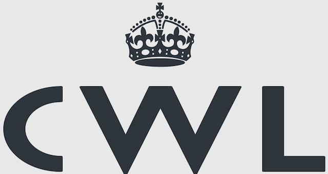
The logos were also now starting to come on a gray background. I wasn’t exactly sure why, but it didn’t really change the process. Also, this sort of gray hue to the letters would become part of how the logo unfolded. In this round, I decided to take a bit of a different approach. I took the following concept and make made my own changes.

With this concept, there was another that had a hovering ball above it. I thought that this effect could be added with two balls, but to have them a different (and possibly contrasting) colour than the letters. After doing basic manipulation to this logo, I came up with something different, but also closer to the final product.
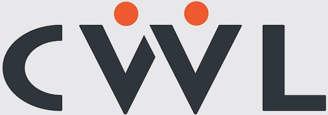
I hoped my crappy design sensibilities didn’t keep Mohamed from understanding what I was after. The choice of orange balls was also odd when I look back on what I came up with. But, it was conveying something, and it gave Mohamed a chance to go back and refine this idea. We were on to the final round of logos. The next step included five concepts, and the final would be a combination of two of them. The logo I felt was right was this one.
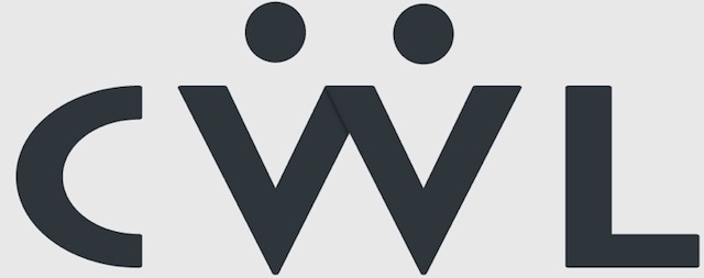
But, while this was the right idea, it wasn’t yet done. I asked Mohamed to make the hovering balls more of a maroon colour (a look that he provided in another version). With the combination of letters this way and the balls in a dark red hue – this was how the final logo was going to look. After the fifth round, a final logo proof was sent (along with the companion Adobe Illustrator file), and this is what the final CWL logo would be.
The process was a long one – lasting more than a month. But, I feel that the product of all this back and forth is a logo that fits well with the company’s technology sensibilities, but has a certain degree of playfulness to it. These days, I like to jokingly tell people that see it that the “W” is a silhouette of two people arm wrestling. You, too, might see something entirely different in this; and that’s the beauty of a logo that might be simple, but contain more (if looking closer). Also, one nice by-product of the way this logo turned out is the kind of other designs I can come up with. I look forward to giving you a few Google-style logo changes on different notable days.
Since this was such a good experience, I wanted to learn more about Mohamed’s company iTQan, and more about his graphic design startup. I asked him to do a short interview, and he was nice enough to sit down with me over a coffee and discuss those ideas and much more. The interview turned out so good that I decided to split that into a second part.
Watch out for the concluding second part of this logo design series, publishing here shortly.
