First Look: Reading And Publishing With Google Currents
![]() This small news app from Google really came out under the radar for me (and that’s saying something). Google Currents is a news reading application made for the iPhone/iPad and Android. While this application is only available in the United States, you can still get your hands on it. So, why would Google - already offering a newsreader - offer another news reader? Is this a better experience than Google Reader? Read on for more about this interesting new application.
This small news app from Google really came out under the radar for me (and that’s saying something). Google Currents is a news reading application made for the iPhone/iPad and Android. While this application is only available in the United States, you can still get your hands on it. So, why would Google - already offering a newsreader - offer another news reader? Is this a better experience than Google Reader? Read on for more about this interesting new application.
When you first open the application, you’re greeted with something very different from what you’d find in Google Reader. In Google Reader, news items are represented with an eMail metaphor. In Google Currents, news appears to be more like a newspaper. The news items flash through the top half of the screen and the process of seeing more happens in the “Library” or “Trending” areas at the bottom of the screen. What’s interesting here is that Google is making an effort to compete with the likes of Flipboard - and they do it quite admirably. Inside the pre-made libraries (that you can search through), you find articles laid out in a nicely read format that invites you to swipe to the right or left for reading. The familiar controls are there too - back, contents, share. The reading process is almost indicative of using an eReader and not browsing the web.
What you might also notice is that Google seems to want a measure of control over how the news is presented. Sure, you can get at&t RSS feeds (I’ll show you that later), but for the most part - the items you see in your library are a result of someone publishing this content. Perhaps in the future, this could be a large revenue source for Google?
When you read an article - the layout is quite nice - take a look at this:
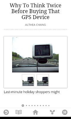
That kind of large font style, lots of whitespace and scroller at the bottom is indeed like something you’d see on an eReader.
What about publishing?
Publishing to the Library seems pretty dirt-simple. Also, when setting up your edition - you get to see how it runs on various devices. This is quit a slick interface for what might seems to be a serious point of frustration for content creators. The options don’t appear to be extensive - but it’s a great starting point:
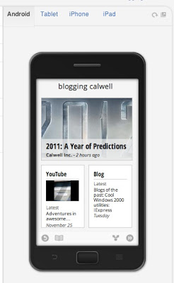
So, while content creation is beyond the scope of this article - what’s clear is that creating and pushing content to Currents is quick, easy and likely to be more powerful as use ramps up. Incidentally, you find this blog in Google Currents by searching for “Blogging CWL” and then adding the library.
Issues
While pagination is always tricky - I can imagine taking content from the web in this automated form is going to be more difficult if the creators try to exert more control. Looking at one such article on Fast Company I noticed a text overlap at the top of the screen.
It appears as though the headline of the library was placed under the main logo for the company. What’s to blame here is likely the lack of space, but if this were text you’d want to read - this may really affect your enjoyment of the article. I expect to see lots of these kinds of things that need to be worked out.
Moreover, Google is setting a dangerous precedent with the settings screen:
This format, by far, goes out of it’s way to break all the common Google interface conventions for settings screens. Given that keeping a common set of interface elements is essential to the ease of getting around and usage, this should be worked on to retain a similar look and feel so people are not confused. Google has it’s own set of guidelines that appear to clearly have been broken here.
What about Google Reader?
This is clearly not a replacement for that. Google Reader is incredibly useful for getting through massive amounts of news items. Currents is more like taking a slow walk through those same items. Given that, you can actually get to your linked Google Reader subscriptions in the “Add” screen. Scroll down to find the “Google Reader” option.
You then can choose any of your subscriptions to add as a library and view in the main interface of Currents.
So, Currents looks like a winner. The amazing platform support, the ease of publishing content and a reading experience that will likely only get better as Google leverages it’s own ecosystem in the application. If I were Flipboard, I might be more than a little worried.