Windows 8: Permission Dialog Changes
Looking at permissions dialogs for both Windows 7 and Windows 8, you’d be forgiven if you thought they looked exactly the same. Essentially they do, but the changes that Microsoft have brought to permissions appear to be more involved when you go past the surface. One of the most common things an IT Guy/Girl or administrator will have to do is change file or folder permissions. I’m going to take a look at how the graphical user interface for file permissions is evolving into something new and different in Windows 8. Please do note, this is based on beta software, so these things may change.
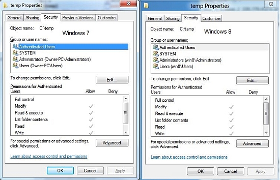
Here they are, the dialog for permissions in Windows 7 and Windows 8 sitting side by side. There really is no difference except for the way the user interface looks. You could also say that some of the text is clearer, and that would be true. The real differences, however, come when we look deeper and start changing permissions.
If you click on “Advanced”, you see more of what Microsoft seems to be after with much of Windows 8. Give you access to some things faster and with less clicks. A noble goal I would say for sure. Here is a look at the two dialog side by side.
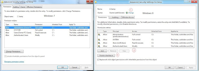
Based on the above picture, there are three major points of interest:
1. Instead of having to go to another tab to get at Ownership, you go there right in this window (and you can also see who currently owns the object). This is an improvement, but not so much in terms of less clicks.
2. A real improvement for common tasks, you don’t have to click in to get at the add and remove buttons to add or remove user permissions. This alone will save a number of clicks in the permissions interface.
3. Another addition that is generally only exposed in dialog below, the disable inheritance and reset permissions on all objects below can be done from here. This change also should save a number of clicks in the interface when released.
Another interesting interface change I noticed was actually on two different windows, but they performed the same operation. Take a look at this:
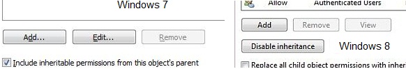
I’m really not sure why Microsoft did it – but they decided to change the order of buttons. The Add, Edit, Remove order in Windows 7 is replaced by Add, Remove, View in Windows 8. This is really a design idea, but I wonder why Microsoft chooses to do things like this. Is it really necessary to change the interface so much like this when administrators might have built up a memory as far as the interface use is concerned? This is a real problem with many interfaces today. You might remember the recent change in scrolling behavior in OSX Lion too. There is a certain language to using an interface consistently and when that language is broken, this throws away all the previous interface gains that might have come before.
The final, and probably best interface change to look forward to in permissions is the actual permission listing.
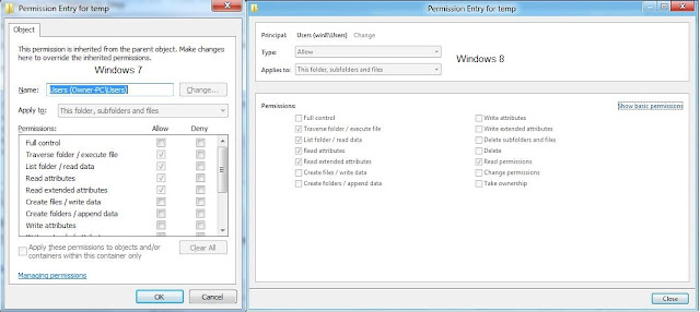
You’ll notice that Microsoft is really making better use of the screen real estate attempting to show all the permissions in one screen. This is a huge help to those of use that spend time having to scroll down to enable the permission at the bottom of the list.
That’s Windows 8 and permissions. This is all still in beta, so it will, no doubt change as the final release gets closer. Tell me what you think of this – are these changes going to make your administration of permissions faster?