
First Impressions: Microsoft Outlook 2013
 Office on Windows is a Microsoft cash cow. When a new version is released, lots of people take notice. On October 11, 2012, Microsoft released the 2013 version of the Office group of applications on Windows. There are a number applications to look at in the package, but today, I wanted to focus on Outlook. The Outlook mail application has existed in a number of incarnations since the early 1990’s when it was included in copies of Microsoft Exchange. The application has had to contend with a number of major computing shifts while eMail has essentially stayed the same. Today, I take a look at what’s new and notable in Outlook 2013.
The biggest obvious change is this version is the inclusion of Office 365 in almost everything Outlook mentions. The beginning wizard even groups Office 365 in the Exchange category, while placing other types of accounts in final “also” sentence. Office 365 is a first-class citizen here. Included in Outlook is the same auto-configuration wizard, and an option to manually setup accounts. The auto-configuration worked well with the hotmail.ca account I tested. Previous versions of Outlook needed plugins to work properly with some servers. With the dropping of Exchange Activesync for Google’s Apps free users in January 2013, those using Outlook are going to be stuck using POP3 and no contact syncing.
Also featured prominently in most of Office is Microsoft’s cloud file system named Skydrive. In Outlook, however, there are no hooks to save things in Skydrive (not even when saving a single message or exporting).
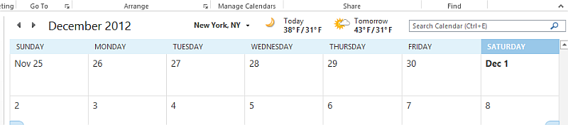
Some of the major new features of Outlook make it look a lot like it’s web counterpart outlook.com. The flat blue interface with a horizontal bar is here. The inline replies are here. The look and feel is similar, right down to the fonts. The esthetic that Microsoft seems to be after is a simpler way (with bigger buttons) to get at stuff. The Mail, Calendar, and People (Contacts) are all bigger and in certain cases give you a preview before the full interface is opened. I like the way Outlook 2013’s bottom bar feels -it’s just cleaner and more appealing. When in the calendar, Microsoft has included a weather ticker, which kind of seems out of place. Would you look for weather details near a calendar?
Metro and Touch Suck
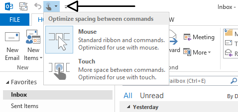
If making things more touch-centric was an overriding goal, Microsoft has failed in this regard with Outlook 2013. Outlook doesn’t appear to have any way to get into a Metro-style mode for reading email. Outlook does include a way to change the upper icons to a touch-friendly mode, but in something that can only be described as perverse – the method of changing the interface is by way of an icon so small, no human would find it easy to touch. Is it possible Outlook automatically knows you’re about to “touch” and changes on the fly? I doubt it. Overall, if you were looking for great touch options in Outlook, you’ll probably be disappointed.
Something I notice about this new interface is that the process of going from the new blue stylized look, to a older Windows common window view is very jarring. I see the application flashing the screen and it almost creates a shaky feeling. This is only occurring for a split second, so many won’t see it – but it has zero subtlety.
Digging Deeper
As with other versions of Outlook, the account settings are in a separate location from the application options. I think this is a bad choice for an tool that should have been streamlined long ago. Access to these two locations feels like it has changed slightly from Outlook 2010, causing even more unnecessary clicking to get there. A notable exception is the inclusion of a “Mail” link in the Control Panel on Windows 8. That’s a familiar way to get to account settings, and Microsoft hasn’t removed it, thankfully.
You my also be familiar with some of the troubleshooting tools available to Outlook. One such tool (accessed by way of holding the CRTL key down while right-clicking the tray icon), are the “Connection Status” and “Test E-mail AutoConfiguration” tools. They’re still included, and appear unchanged over what you’ll see in Outlook 2010.
Not much is different about how account settings are modified and handles. Personal Storage Table (.pst) files are still here and they can be compacted. Offline Storage Table (.ost) files are also still here and can be compacted. The file formats themselves haven’t changed at all. you can easily take a .pst file from Outlook 2013 and open it in Outlook 2010.
What’s Missing?
It seems one interesting omission in Outlook 2013 is the the lack of CalDAV and CardDAV support. Both of these services are standard-based offerings that other tools (like iOS) support. Yet, support in Outlook is nowhere to be seen. A shame.
Final Thoughts
More and more it seems like Outlook is out of touch with modern sensibilities. It can’t be denied that Microsoft is trying to catch up with the best of what the cloud offers, but Outlook and it’s monolithic .pst files and offline feel have no place in today’s hyper-connected environment. Even worse, the differences in the OS X and Windows Outlook products are glaring and should be a real source of embarrassment for Microsoft. If only, say native .pst file access was the same on OS X and Windows, this product would be more compelling. Add to that the Metro-Desktop confusion and too-long upgrade cycle (three years) and you really have problems. As it is, you’ll only want Outlook because you have to take it or you really think it looks pretty and will accept any and all pain to have it.