Windows 8: Metro, A Leap Forward Or A Leap Back?
Windows 8 is coming very, very soon. With it, we have one major shift in computing to handle. This new wrinkle is the Metro interface – designed to fill the user’s entire screen and be something of a general simplification of a Windows system. I’ve been toying with this idea that, as Windows is being pushed into a more mobile way of doing things, it’s also being pushed back as well. Is Metro taking us backward, or is this just a simple-looking way of moving forward?
Summary: In many ways Windows 8’s Metro interface is like the transition from DOS to Windows, but this time we might say backwards.
I was a consultant back in the days of DOS when applications like Accpac and Wordperfect ruled PCs. My involvement with text-based applications (at the time) was to be the IT Guy moving users from those full screen applications to the new windows desktop paradigm.
The transition was not pretty. Users complained about having to use a mouse and the lack of keyboard shortcuts. When there were keyboard shortcuts, that they had to re-learn new ones. Users didn’t like that Windows “popped up” while they were working on things. Other users were annoyed by how slow printing became when they moved to Windows. As a general rule, all of the DOS-based holdouts I encountered would eventually be forced into the new Windows world as application developers also started to support this new way of doing things.
Updated: Looking for a DOS-Based Metro interface? Take a look at this fascinating example of technology from 1983. Yes, 1983. Back then there were some common attributes of how users interacted with these programs:
1. The Interface was very simple, no mouse interaction or limited support
In the early days , few people needed a mouse and fewer programs supported it. over time, DOS applications were written with better support for mouse interactions and some actually had windows that could be opened and closed.
2. Many users interacted with the program fast with keyboard shortcuts or movements
This was a hallmark of DOS applications. Users who were most proficient were able to make use of menu systems and other shortcuts by way of the keyboard. I wonder if you remember the “/” in Lotus123 or “SHIFT+F7” in Wordperfect?
3. The program monopolized the computer and was generally always full screen
This was a function of technology at the time. The Operating System wasn’t multitasking, so when you ran an application, it was the only application you ran until you exited. While the interface of these applications was often very simple, the full screen nature of them made the applications less distracting.
4. There was a limited amount of information that could be shown on the screen due to the technical nature of what was being displayed and how it was being used
Again, the technical limitations of a console application made it difficult to do much with the interface. Some applications did a great job of using the space too, but it was the best you could to do display a certain number of characters on the screen.
Fast forward to some 30 years later, we’re presented with another huge shift. What I’m speaking of is the shift from Windowed applications (with buttons, text boxes, and graphic areas) to that of a full screen, touch and mouse based interface.
Just like the DOS-Windows shift, I expect this transition to be extremely painful. Users that have learned to use applications in a Windowed environment are not going going to be pleased with the Metro style. Some will like it, and the rest of the holdouts will have no choice to switch – but, thankfully that’s years away.
 |
| This is Metro. Apps are full screen |
So what’s behind Metro application anyway? Well, I took a look at them in a recent blog. You may be surprised to know that they’re simply just Web or HTML5 types of applications. What’s funny is I remember a colleague of mine years ago saying “web applications are never going to last”. Wow, he can’t be any more wrong there.
As you see in the above picture, Metro applications fill the screen and have all sorts of great graphics and are touch and mouse interactive. There appears to be limited keyboard shortcuts, but I’m sure that could all be built in to the application if needed. I thought to myself, what if I described new Metro applications with the same 4 attributes of a DOS program?
1. The Interface was very simple, no mouse interaction or limited support
Certainly, one thing you can say about Metro applications is the simplicity. There are distinct lines, larger fonts, it all fills the screen and you aren’t forced to deal with other applications popping up. There are corner “hotspots” that allow you to interact with the interface as well as a number of keyboard shortcuts. I would say that Metro apps are so targeted to touch that we may see it highly favored, doing away with mouse and keyboard interaction altogether.
2. Many users interacted with the program fast with keyboard shortcuts or movements
If we replace keyboard with touch, I think this is a correct statement.
3. The program monopolized the computer and was generally always full screen
Again, very true for the Metro style of application. I think very shortly after the release of Windows
8, we’ll have a whole host of people who will never encounter the Windows desktop or a traditional Windows application for the entire time they own a computer.
4. There was a limited amount of information that could be shown on the screen due to the technical nature of what was being displayed and how it was being used
This is true, but not because of a technical limitation. It’s being limited by choice. When you’re looking at a Metro application, you can’t have a video running in the top corner, and also editing a file in the bottom corner. Metro apps are visually monopolistic by design.
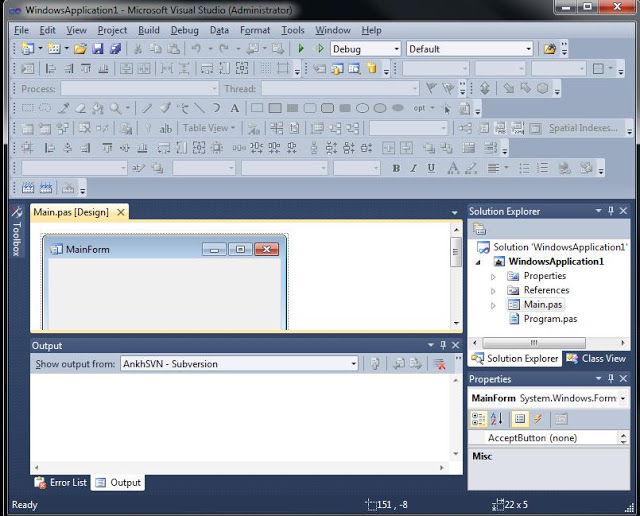 |
| The Windows application. Where do you even start? |
So, I think it’s clear that Metro is a signal of us moving backwards into a more simplistic interface. What will become of the venerable Windows applications with buttons all over the place, toolbars, windows and all sorts other complication busy controls? Is is possible to pack all of that into a Metro interface application? I doubt it, but anything is possible. If we’re looking to make generations of people who only know what the Metro interface looks like, what happens when they finally have to see the above application and use it? I see this same problem existing on OSX too. As it it iOS-ifies itself, we’re left with (possibly) an interface that looks so much like that iPad that more complex applications won’t exist or be usable. Could this push the class divide between the more technical folks and the non-savvy among us to even greater depths?
I do think as major Operating Systems become more mobile-fied, that we’re going have to deal with some of the problems this simplicity is going to create.