Reviewing a New RSS Reader: FeedRdr
One of the coolest things I get to do is offer my thoughts on new products. Sometimes I come across them because the author is asking or contacting me for advice, and sometimes it’s just random. This time around I came across a new RSS Reader named FeedRdr on Reddit and offered my thoughts on the new tool. What follows is the impressions I posted there.
The complete text of my thoughts can be found on Reddit. This is an abridged version.
1. To reiterate what others have said – your landing page should at least have a screenshot or some visual of what the reader looks like with a feed. Since this is very much driven by preference, I think that’s the absolute minimum you should show on the landing page. After that, list the features.
2. Adding a “Streaming Group” and then a single site (by URL) is perhaps too much friction for users just getting started. I would remove the work needed to get a user going. Let them paste a feed url somewhere and start immediately.
3. The same goes for needing a “Stream Name” when adding a site. Take the site’s name and remove this text box (just leave the URL). Let me rename it later.
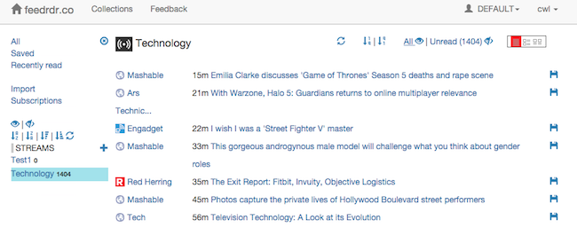
4. In one case (Subscribing to this sub’s feed), FeedRdr says it added the feed, but going back to my list, it is not there. I wasn’t able to add a single feed manually – I would just get various errors, so I moved on to trying a Collection. Your feed parser has to be rock solid.
5. I didn’t go at it enough, but there is something missing (or not right) about the “Stream” idea. Controlling what goes in a stream and simply seeing what’s there needs a better interface I think.
6. In the compact view (or others), include some way of marking progress. The only thing I can see that marks an article as read – involves clicking on the link or scrolling. Feed reading (for some) is about speed, so include some way of manually marking them as read at some point.
7. “Sign Out” is misspelled (unless we should be singing).
8. “Profiles” should probably read “Profile” here.
9. Text along the top is not aligned well.. it appears to be higher than other stuff.
10. What’s commonly called a “Star” in most feed readers (like the defunct Google Reader), you’re calling “Save“. I would consider changing it to “Star” so users don’t need to re-learn a common activity, and aren’t thinking that they’ll be saving HTML (or some other file-based save).
11. Are there keyboard shortcuts? I did not see a reference to this anywhere. It might be an idea to create a simple legend of icons and shortcuts (if there are any).
Final Thoughts
I do like the feed title and icon representations. That is done well and makes feed recognition much better. Scrolling the feed seems very fluid and clean. The simple underline of a link is a good way of showing where my mouse is, but not messing with my ability to read the headline. The sparseness of this interface and white background is welcome (perhaps offering a black night reading mode would be nice too). It’s a great start, and I look forward to seeing how this progresses!
FeedRdr can be found at feedrdr.co and is currently offering free accounts.


